Here’s a example of how a little « treatment » can enhance an image. Some people would throw up their arms in horror and say stupid things like « This never happened before Photoshop » etc.
Of course it did – for more than 80 years there have been a whole series of different contrast printing papers that photographers put to good use in their darkrooms. With the advent of colour photography, home printing became more complex, but « adjustments » were always made, to increase or decrease colour temperature, take out dust etc. To say we have never « treated » images before Photoshop is a fallacy. Click on all the images below to enlarge them.
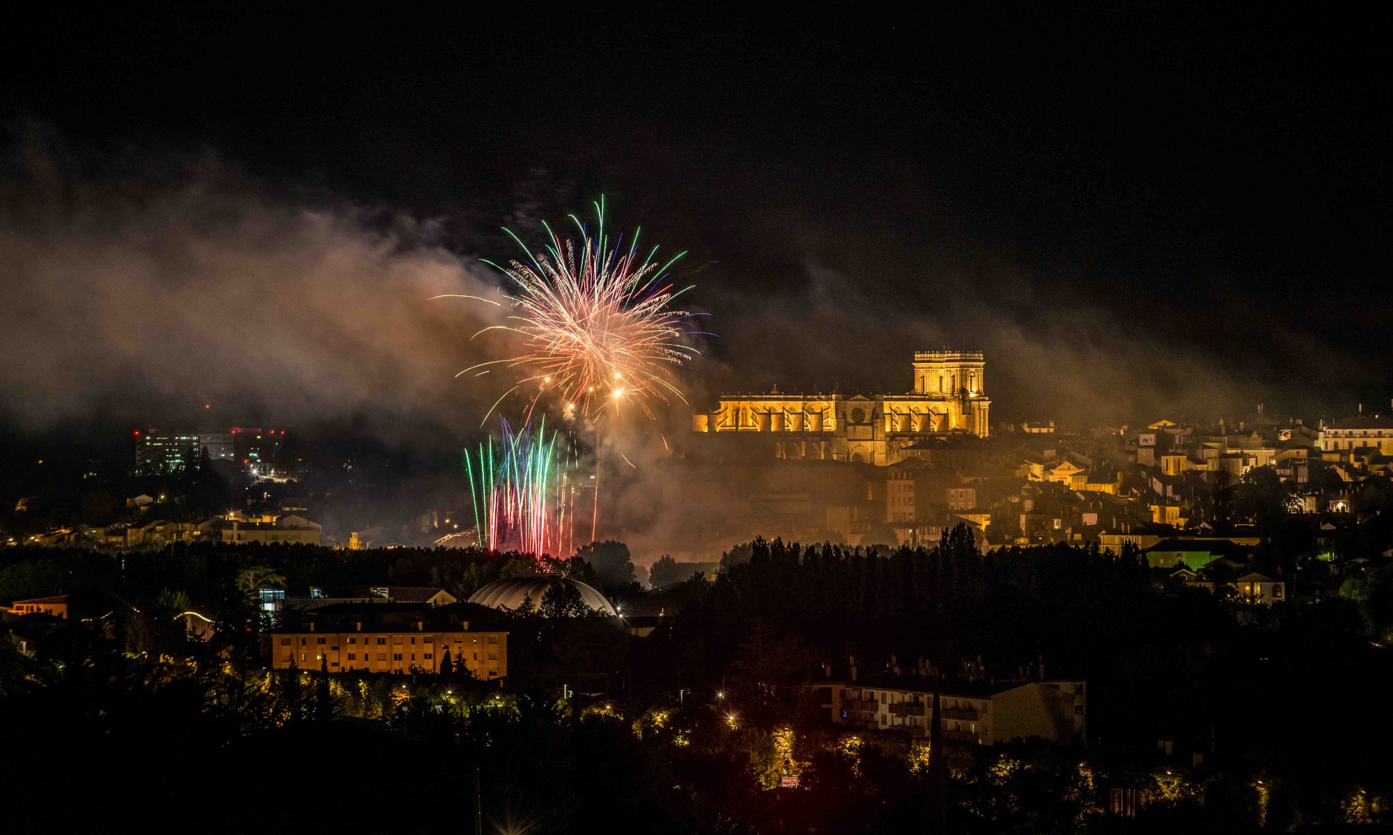
This is the final « treated » image
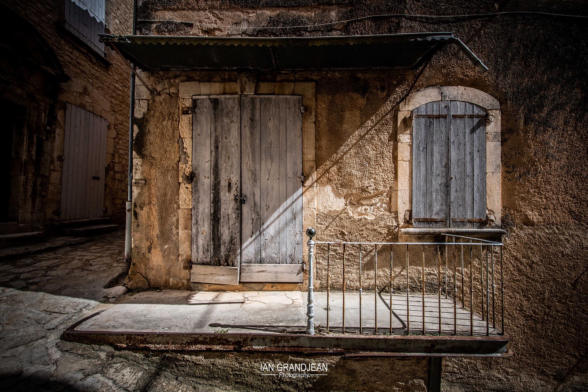
To get there, we started with this…
…which has had no colour or exposure adjustments – just simple noise reduction and lens correction.
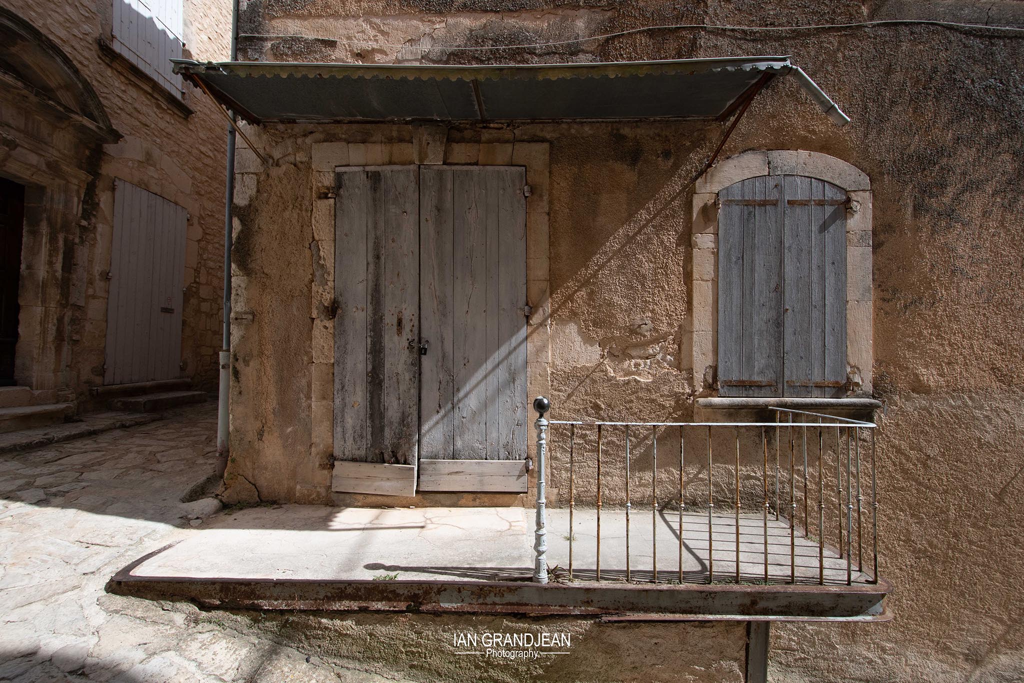
I applied a few very simple adjustments to get this…
…which isn’t too bad, but I felt it needed a little more contrast…and I also added a « vignette » to loose the hard edges…which became the final version.
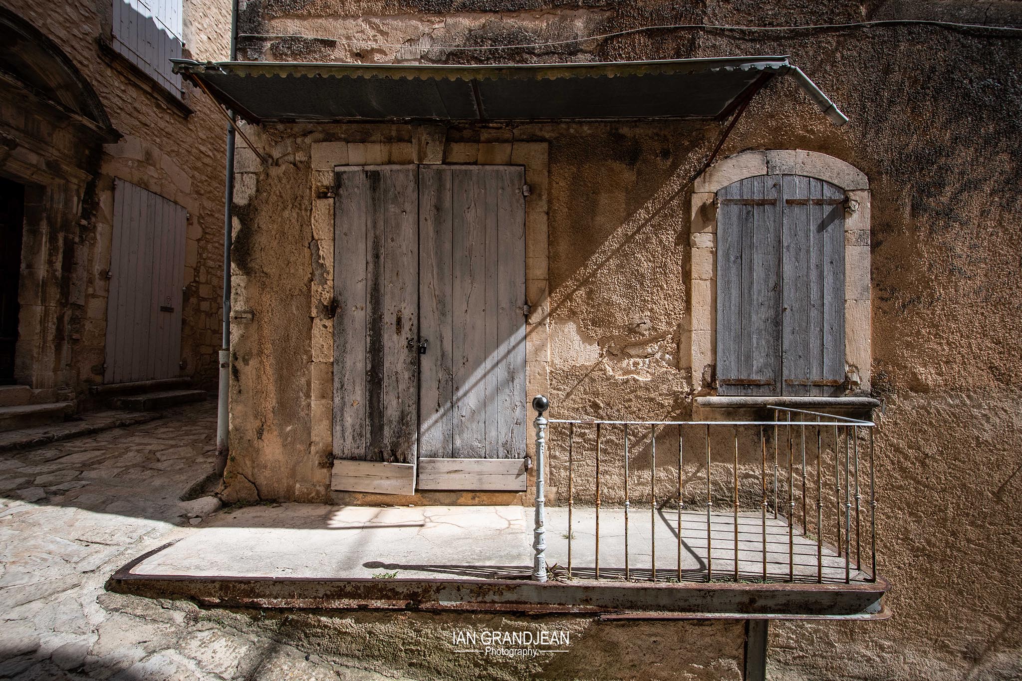
I also created a black & white version, just for fun, as high contrast black & whites are a favourite of mine…
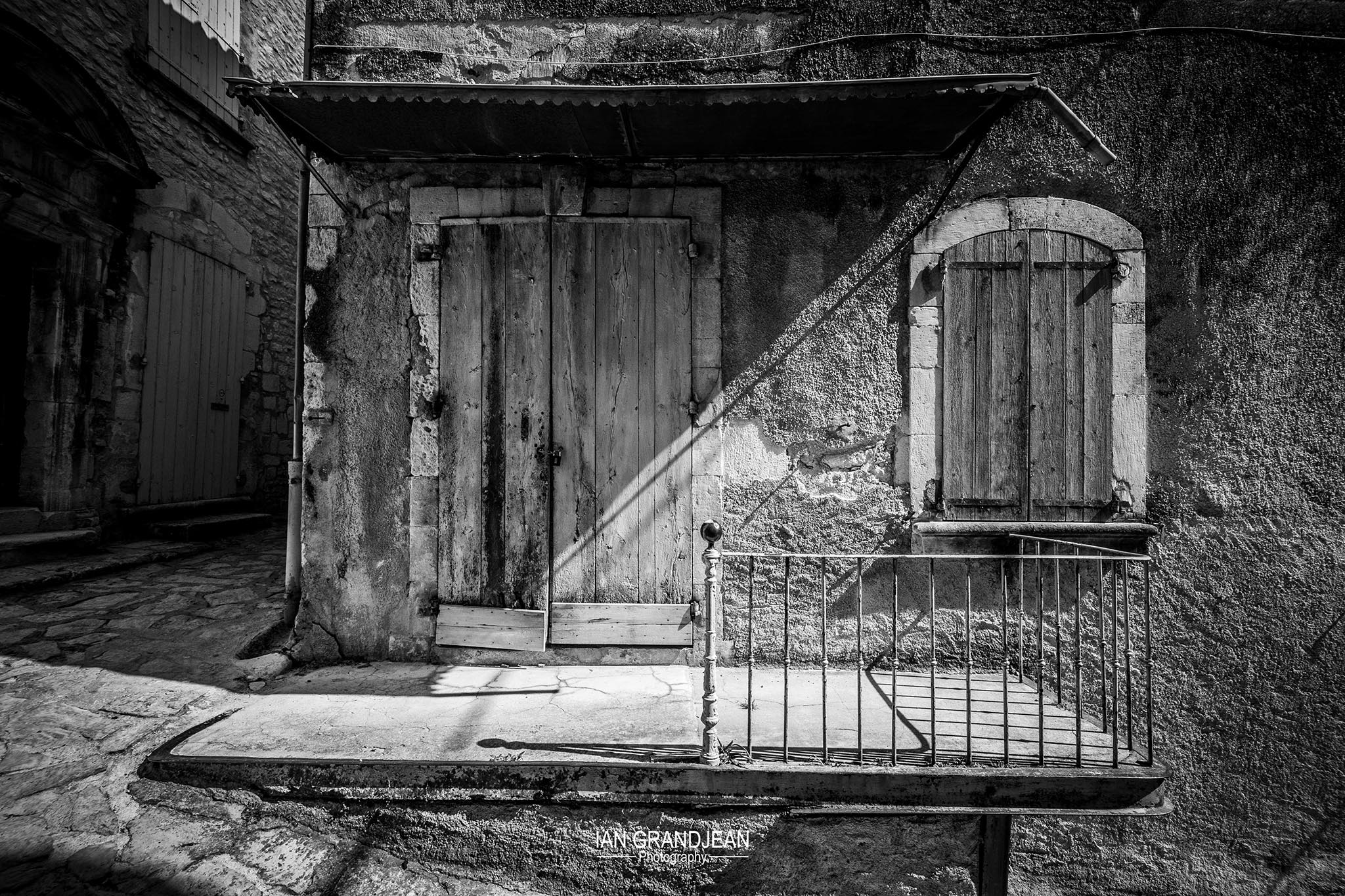
It’s ok – but I think I prefer the final colour version – I fully realize that I’m in a minority of one, and probably the only person who likes this – I just thought it showed a very simple approach to creating a more interesting image.
But don’t forget – the original image needs to be correctly exposed in the first place. The people who blindly fire off their cameras all over the place, not taking any account of the exposures, are basically wasting their time – when they download the initial images they will have to spend a considerable time trying to get them back, more or less, to a « correct » exposure (but isn’t really) and then even more time and effort to fine-tune the image to make it worth looking at, which more often than not, it isn’t.
Getting it right in the camera is primordial – with a good base, you can pretty much do whatever you want.